For comparison you can see my old logo here! Very crude, I put it together myself back in 2010 using some crude tools. I wrote a post about it here and how this blog originally started with the title Photon Torpedoes. I was always bothered by several things about my ham-fisted logo, first of all, for a blog where I do a lot of DC Comics stuff, it doesn't look like a DC Comic.
Scott Dutton previously revamped my header on Giant-Size Marvel and offered to do the same here. His new logo is dynamic and looks like the 1970s Super Spectaculars. The characters are from the 1970s and all resemble that era's Justice League. We've got a DC bullet and still at the low low price of 50 cents! And a number one issue.
To assemble this logo, Scott used the masthead from Superman Family 170, circa 1975! When giant-size DC comics were 50 cents and contained lots of content. Scott says "I added letters in the same style to finish the words. Geek was set in a suitably-fat typeface so it would stand out."
The Justice League figures come from this 1982 style guide page by José Luis García-López with inks by Dick Giordano. I think it's great how Black Canary (always my favorite) is waving hello to the viewer. Very nice. The days when J'onn J'onzz the Martian Manhunter was part of the team. Man, I miss that version of Green Arrow, too.
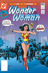
You can see Scott Dutton's specific coloring work on DC Comics here! Some great classic covers are there and creations of covers that were never published. Click on the images on his blog to see his process for each one. This particular recoloring of Wonder Woman 269 really made me pay attention to Scott's work. I love how he accentuated Wonder Woman in the foreground by changing the color scheme of the background players. That is a classic DC Comics vibe to me.
(Not Scott's work but my clumsy attempt!)
I've kind of let this blog go dormant over the past couple of years. I've always renewed the domain thinking I will get back to it. I gave up a while back, depressed at times over lack of traffic. My other blog, Giant-Size Marvel, gets a lot more eyeballs, I suspect because my keywords are better there and Marvel properties are so hot. I started this blog as Photon Torpedoes back in 2006 and I covered every geek topic under the sun. I complained every time someone revamped a comics character. I was doing images of comics cover art before Tumblr existed. I decided to split off all my Marvel stuff into Giant-Size Marvel and saw how having a narrow focus increases more interest. For this blog, I renamed it Giant-Size Geek in 2010, more DC centric but also reviewing some books and movies.
Why continue to blog at all? I decided it doesn't matter if I get traffic, I disabled all the crappy ads I used to have. I simply enjoy the act of writing once in a while and revisiting the comics that I love. I used to snark more. I have decided snarking or complaining is a waste of time and it's better to focus on things you feel mostly positive about. I won't update the blog every day, but perhaps 1-2 times per week from now on. Until I get lazy again.
Nuff Said!


Rock on, my friend. I've always enjoyed your geekiness.
ReplyDeleteThanks, Lefty!
Delete